AZORIA - Brand RE-design
Assets: Logo, Packaging, Social & Print Ads, Business Cards.
Azoria is a feminine nod to the Azores Islands. A beautiful collection of islands in the middle of the Atlantic Ocean. Specifically, Pico island which is known for it being covered with volcanic rock in juxtaposition to the calm soothing waters surrounding it.
Azoria is a local company in Vancouver, BC, run by the talented jeweller Dina Fraga that sells a wide range of natural stone jewelry. All of the products are made local here in Vancouver, by hand, and unique in their own way. No two are the same as Dina makes them uniquely for you.
Azoria is a hand-made jewelry company that makes jewelry from natural stones and minerals. The brand is themed around the beautiful island of Pico in the Azores Islands where my family is from. Applications used for this project include Adobe Illustrator and Adobe Photoshop.
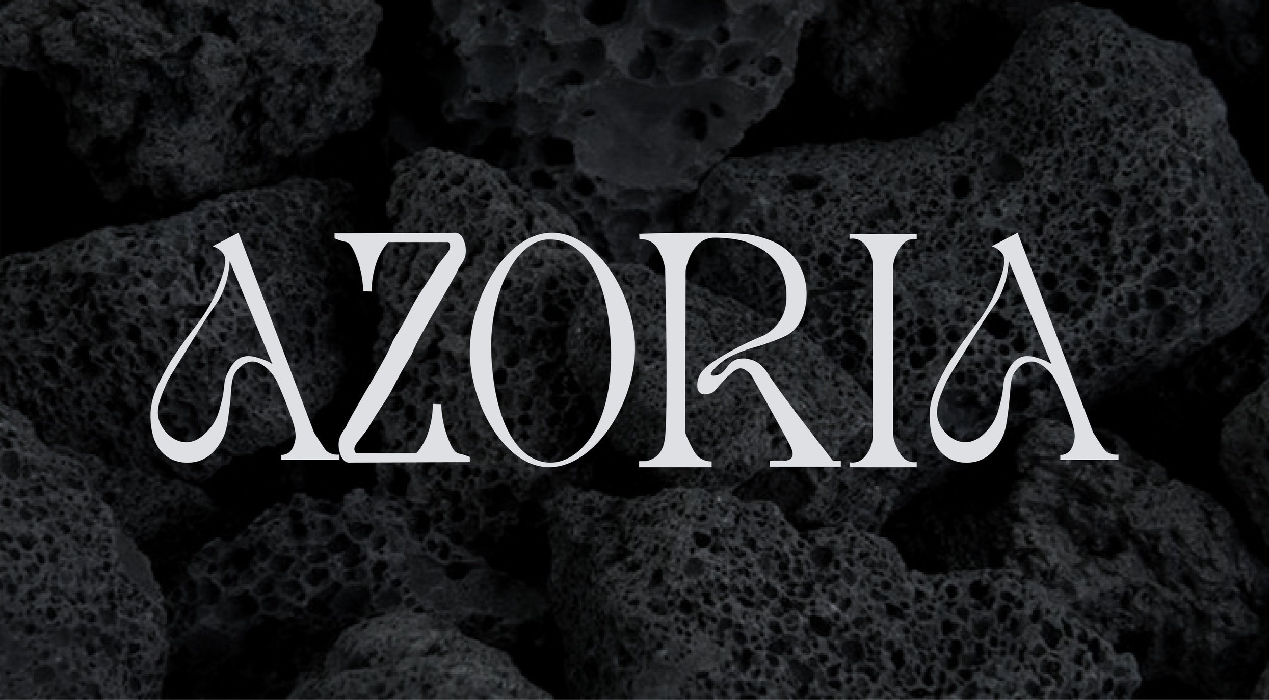
I drew inspiration from the volcanic rock and raging ocean waves that surround the island, whilst also keeping an feminine elegant feel to the overall design. The Azoria logo is also designed with the silhouette of the volcano that inhabits the island.

Azoria’s Rationale:
The goal behind Azoria is to create products that allow individuals to take a piece of beauty and sentiment from “Azoria’s Atlantis”.
Keywords: Elegant, Clean, Simplistic, Earthy, Natural, Luxurious.
Target Audience:
• Age 30+
• Primarily Females
• Greater Vancouver
• Working professionals
• Passionate about fine jewelry
• Looking to invest in jewelry
Moodboard & Logo Conceptual Stage:
For the logo design and overall aesthetic I was inspired by the powerful yet peaceful ocean that surrounds the Azorean islands. I wanted Azoria to be elegant and clean, so I incorporated those themes into the general aesthetic and logo design.
Azoria's final logo (below) is a type logo made from my own illustrative type. It is very minimal yet soft, representing ocean waves and its simple beauty.
The secondary logo is a deconstructed version of the original font with the outline of Pico Mountain above it. This logo coheirs with the brand identity.
The logo is an integral part of the Azoria brand and should be used thoughtfully and consistently.
Most often the logo will be presented in all black on a light blue neutral background. However, the logo can be adapted for use on a darker background with a charcoal black fill.is a logotype made from a mix of illustrative type and inspiration from the MOLIKA typeface. It is very minimal yet edgy, to represent the brands identity.
Typography:
For all additional text used, Charter Roman will be used. This font is perfectly complimentary to the type logo that is both visually appealing but easy to read. Charter Roman is a modern serif font that has a sleek and sophisticated yet bold and sexy font that is perfect for Azoria’s Branding.
Colour Palette:
This colour palette was chosen to represent the unique volcanic rock that inhabits the island of Pico, while adding a feminine touch to it with the light blue of the waters surrounding. All of the brand’s packaging and content is meant to be clean, simple, and elegant. All text will either be light blue on top of charcoal black or charcoal black on top of the light blue.
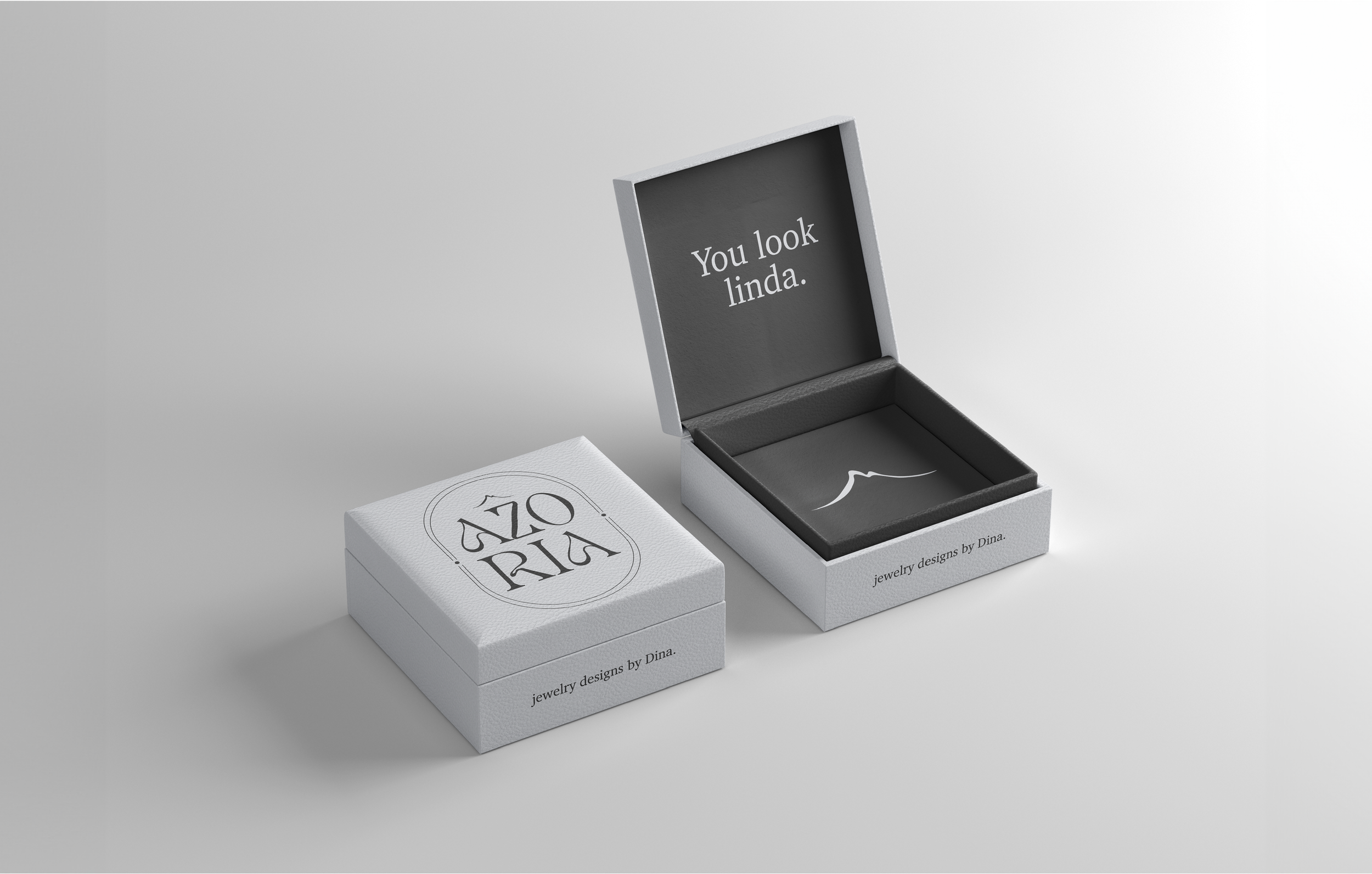
Packaging & Multi-Media ad finals:
The final brand re-design deliverables consist of: a business card, shopping bag, tissue paper, shipping box, jewelry box, hang tag labels, an Instagram ad, and a single page magazine ad.
Firstly, I researched how to communicate with a more mature audience and how similar services and products that primarily address the same audience advertise for inspiration. I incorporated Azoria's main headline and message throughout all deliverables and used a simplistic yet elegant mix of typography and graphics to convey class and luxury. I chose to keep a design aesthetic of volcanic rock and the ocean, used in the graphics. The pattern I illustrated for the tissue paper is an artistic interpretation the waves in the colour palette. The overall aesthetic is carried out through all compositions remaining clean, simple and elegant.


Final Mockups:
I chose to keep a design aesthetic of the colour palette, and used complimentary black and white graphics. The overall aesthetic is carried out through all compositions remaining simplistic, elegant and clean. All compositions were made into mockups using tools in Photoshop. I used mockups that had a variety of 3D materials to make the surrounding materials look realistic and relative to the brand identity.