

Kured. - Menu design
Assets: Logo, Print and Digital Menus.
Kured is an Italian infused French fine-dining restaurant located in Vancouver, British Columbia. The dishes on the menu include the finest charcuterie boards and traditional French and Italian dishes.
The goal of the project was to create a print and digital menu design to go along with the updated interior of this restaurant.
Applications used in this project include Adobe Illustrator, Adobe InDesign, and Adobe Photoshop.

Kured’s Rationale:
Kured is an upscale Italian and French fusion restaurant located in Gastown, Vancouver that provides the finest charcuterie boards and dining experience.
To match the sophisticated feel of the restaurant, I created a clean layout and composition with illustrations of typical cuisine throughout the menu.
Every part of the menu design is in alignment with a focus on simplicity and also sustainability. This includes the physical menu, with a cover made of recycled paper.
The paper pages of the menu measure 17” by 11”. The logo is etched into the front panel of the menu for a hand-crafted look.
Target Audience:
• Age 21+
• All genders
• Greater Vancouver
• Working professionals & foodies
• Passionate about sustainable farm to table restaurants
• Fine dining lovers
Moodboard & Conceptual Stage:
For the logo design and overall aesthetic I was inspired by a raw and authentic dining experience one would experience in the streets of Rome or in the South of France. I wanted Kured to have clean and simplistic design to focus on the authenticity and quality of the food and service. A constraint of this project included the dim lights of the restaurant. For this reason, I designed the physical menu on a light, off-white background, while the digital menu features a darker green background.
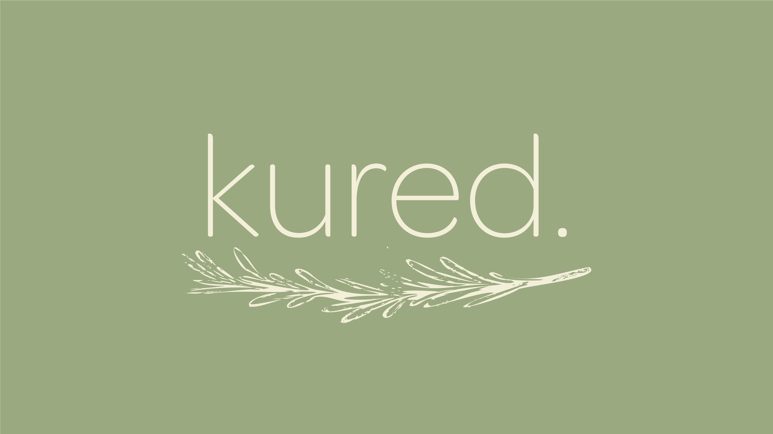
Kured’s final logo (below) is a logotype with original illustration of rosemary. It is very minimal and clean, to represent the brands identity and its fierce emphasis on letting “the food speak for itself”.
Typography:
For all headings and subheadings, Omnes Regular will be used. Omnes Regular meets the need for a rounded typeface which is neither overly mannered nor excessively literal in its approach making it perfect for Kured's headings.
Omnes Light will be used for all of Kured's body copy text. Omnes Light is a sans-serif font in the same font family as the headings text making it overall cohesive and legible for the menu body text.
While both fonts are in the same font family, there is a contrast in hierarchy due to weight and size of text used in the compositions.
Colour Palette:
Kured’s colour palette was chosen to represent earthy calm tones. All of the brand's content is meant to be clean and simple with an authentic Italian and French touch. All text will either be cream on top of green or green on top of the cream.
Multi-Media Menu finals:
The final menu design deliverables consist of: a tri-fold menu (inside & outside), wine list insert, a features table tent, and a continuous scroll tablet menu.
Firstly, I researched how to communicate cohesively through menu design and to keep the compositions legible on all platforms. I remained consistent aligning text and sectioning the menu into appropriate categories to make the menu flow naturally. The wine list for the menu is designed as an insert. I used Adobe InDesign to create the pages of the physical menu, making use of master pages and guidelines for consistency. The electronic menu is designed for an iPad Retina (aspect ratio of 4:3). I designed the endless scrolling menu on Adobe Illustrator so I could extend the art board to adapt to seasonal menu changes.
I created consistency between both print and digital menus by including the food illustrations on both keeping with the overall elegance and theme of the restaurant.


Final Mockups:
I chose to keep a design aesthetic of the colour palette, and used complimentary hand drawn illustrations to keep the authentic feel of Kured. The overall aesthetic is carried out through all compositions remaining clean, simple and raw. All compositions were made into mockups using tools in Photoshop. I used mockups that had a variety of 3D materials to make the surrounding materials look realistic and relative to the brand identity.


