

Nour - Branding & Packaging design
Assets: Logo, Skincare Packaging, Social & Print Ads, Business Cards.
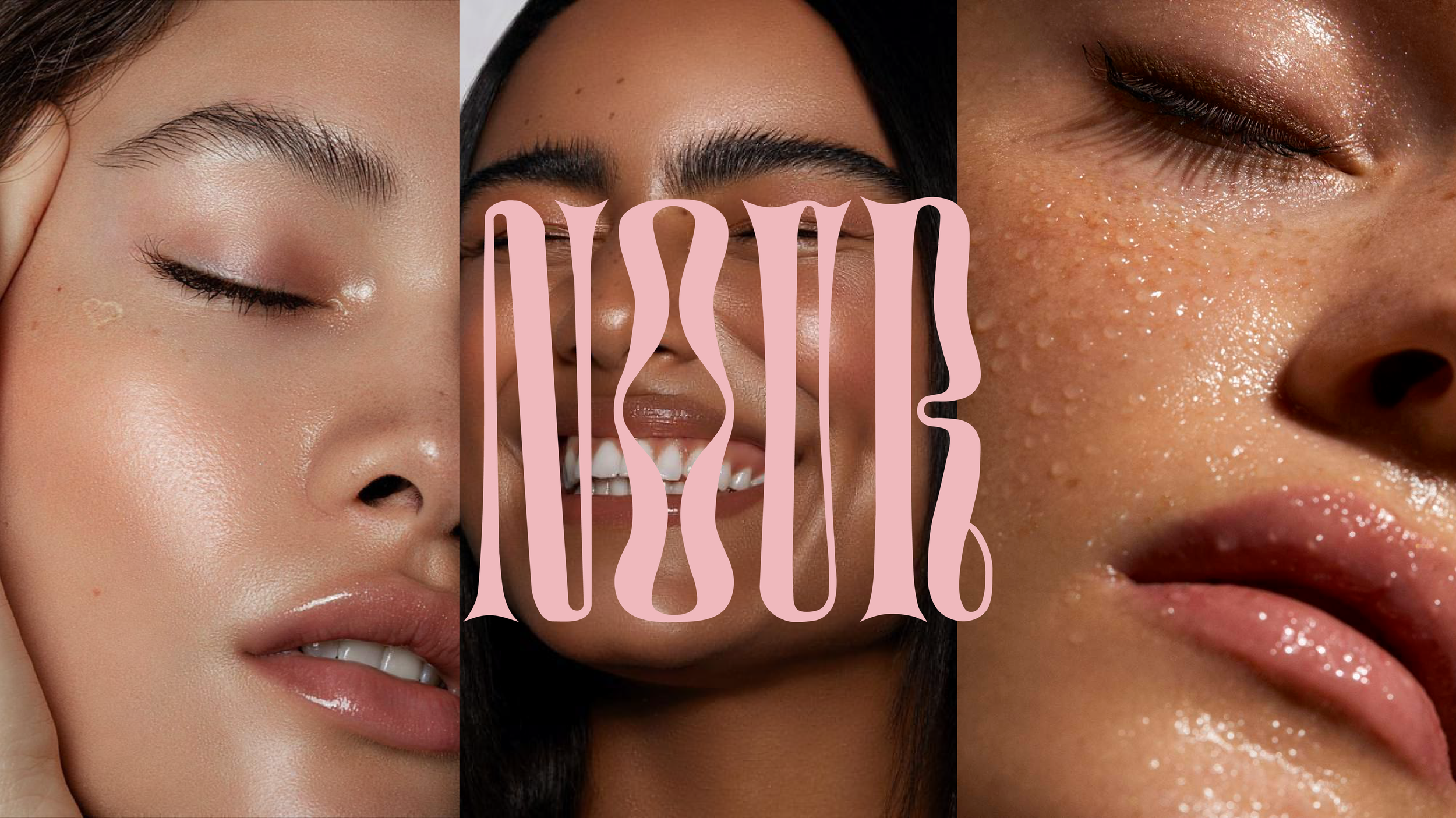
Nour [ n.o.u.r ]
Nour is a gender-neutral name of Arabic and Aramaic origin, meaning "light" or "radiance."
Nour is a local skin care company in Vancouver, BC, that sells a wide range of natural skin care and beauty products. These products range from cleanser/moisturizer to face masks and lip oils. All of the products are made local here in Vancouver, by small batch, hand made manufacturing to create delicately crafted products to suite all different skin types.
The goal behind Nour is to create products that allow individuals to shine their individual beauty inside out. Nour is on a mission to shine a light on the importance of self love and self care, and to empower individuals that their beauty is one that radiates from the inside out.
Keywords: Clean, Women Empowerment, Self Care, Beauty, Natural, Sexy, Luxurious, Self Love.
Nour is a product and branding package I made for my first class in Portfolio Design at BCIT. It was a great chance to showcase my love and skill for brand identity and an overall fun experience to create a theoretical brand design package.

NOUR’s Rationale:
With the world becoming more and more progressive as the years go on the importance of individuality and embracing your own personal uniqueness is at an up-most importance. Now we as a collective are encouraged to reclaim our own empowerment and to shine who we are from the inside out. NOUR's mission piggybacks on this idea to encourage whoever uses their products to find what it means to be them and to illuminate their own beautiful personalities. The goal was to create an inspiring brand for young male and females, to help them feel confident in their own skin and break away from norms in reclaiming who they really are.
Target Audience:
• Age 18-35
• Primarily Females
• Greater Vancouver
• Students/working professionals
• Passionate about clean products
• Social Media Inflencers
Moodboard & Logo Conceptual Stage:
For the logo design and overall aesthetic I was inspired by beauty and skincare companies like Glossier and Saie. I wanted NOUR to be feminine and luxurious, so I incorporated those themes into the general aesthetic and logo design.
NOUR's final logo (below) is a logotype made from a mix of illustrative type and inspiration from the MOLIKA typeface. It is very minimal yet edgy, to represent the brands identity.
Typography:
For the Logo inspiration, MOLIKA typeface was the inspiration. MOLIKA has a unique and irregular proportions and curves, making it a perfect font when making a logotype that is both complex but easy to read, making it a luxurious yet still fun logo.
For all headings and subheadings, Eugusto Regular will be used. Eugusto Regular is a modern serif font that has a sleek and sophisticated yet bold and sexy font that is perfect for Nour's headings.
Montserrat Medium will be used for all of Nour's body copy text. Montserrat is a sans-serif font made by Julieta Ulanovsky for Google Fonts that features rounded and simple curves, making it a legible font.
Colour Palette:
This colour palette was chosen to represent the base colours of bare skin, while adding a feminine touch to it with the pink. All of the brand's packaging and content is meant to be clean and simple, yet grungy and edgy. All text will either be pink/cream on top of black or black on top of the pink/cream.
Multi-Media ad finals:
The final multi-media advertisement deliverables consist of: a one page magazine ad, split page magazine ad, handout, social media profile picture, social media (LinkedIn, Facebook, YouTube) banner, Instagram post, and Instagram story.
Firstly, I researched how to communicate with young audience and how similar services and products that primarily address the same audience advertise for inspiration. I used strong typography and incorporated NOUR's main headline and message throughout all ads. I remained consistent with the colour palette and typography and used strong contrast between images and type to create a bold design aesthetic. I used Adobe Illustrator to use dynamic text to incorporate with the images and several colour overlays and blending modes in Photoshop to make the colours and overall design cohesive.


Final Mockups:
I chose to keep a design aesthetic of the colour palette, and used complimentary black and white graphics. The overall aesthetic is carried out through all compositions remaining dynamic, feminine and sexy. All compositions were made into mockups using tools in Photoshop. I used mockups that had a variety of 3D materials to make the surrounding materials look realistic and relative to the brand identity.


