

Swell Surf Magazine - editorial design
Assets: Assets: Multi Media Magazine Layout
Swell is a new surf lifestyle magazine being developed for print and digital mediums. I was responsible for creating the branding, promotional images and editorial design for the magazine.
This magazine is made for those who love the surf life whether they’re currently (or dreaming of) living out on the water. Swell is not just a magazine, but a community for like-minded people who love surf culture.
Designing a magazine that had the same look and feel across print and digital mediums was a constraint of the project. I adapted to this by carefully tweaking the layout for each medium with legibility in mind.
Applications used: Adobe Illustrator, Adobe Photoshop.

swell’s Rationale:
Swell is a modern and maximal surf magazine. It focuses on the unique gems in the smaller communities of surf culture and the lifestyles of people who are passionate about the sport. It has news, features of surf culture, and lifestyle; displaying hot spots from all over the world per volume. Its main goal is to foster conversations in the surfing sphere and to create an inviting community for surfers from all over the globe.
The name “Swell” came about with my own personal experience surfing and saying “when you're in the swell nothing else matters”. The act of surfing is deeply meditative and releasing activity as when you're out on the water you’re alone with your thoughts and pushing your body to the extremes physically. I wanted this to reflect in the purpose of this magazine. That when you read Swell you can expand your knowledge of places, people, and things associated with this deep reflective activity.
For the design of this magazine, I wanted to keep it clean, modern, yet dynamic and interesting. I wanted the photos throughout the magazine to reflect the look of the magazine as well. I wanted a simple yet edgy design to the layouts. All the layouts are clean, bringing out the important aspects of the articles. I wanted a lot of white space, to keep it very simple, but modern to attract all ages.
Moodboard & LOGO Conceptual Stage:
For the overall design aesthetic I was inspired by retro surf and lifestyle magazines. I wanted Swell to have a modern take on this retro surf aesthetic by incorporating dynamic designs, colours, and imagery.
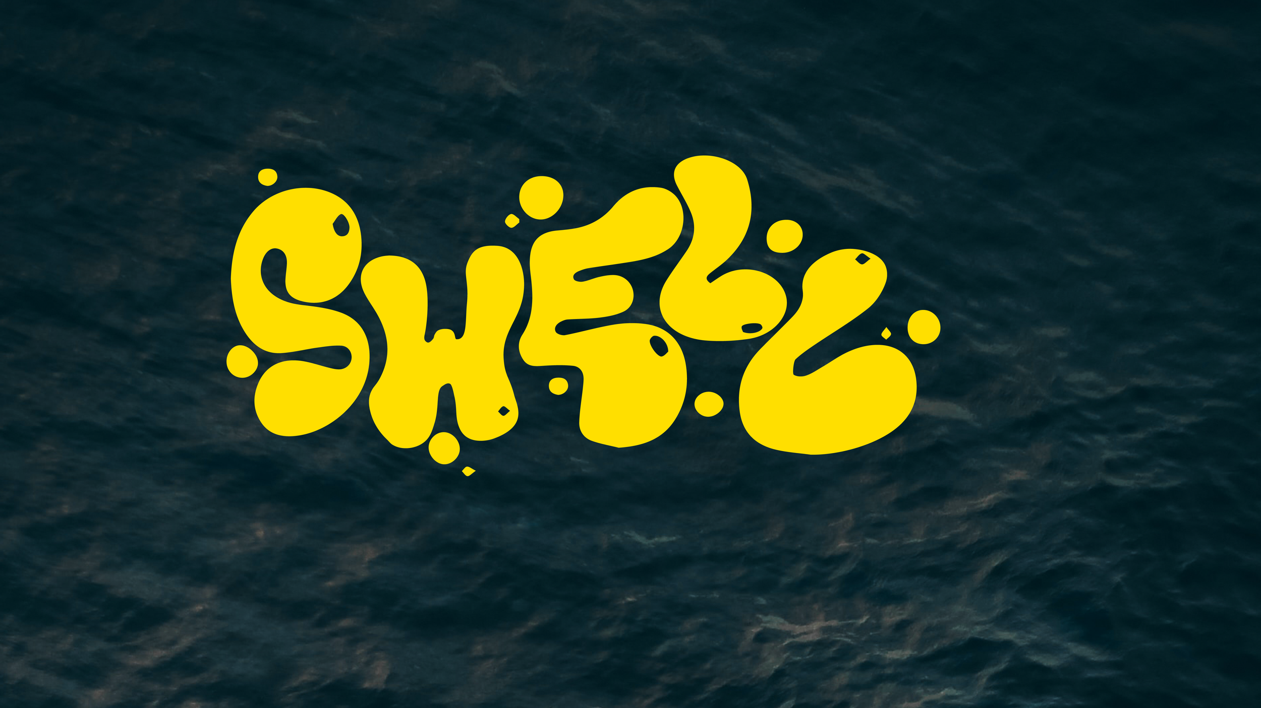
Swell's final logo (below) is a logotype made from illustrative type inspired but the ocean. It is maximal, bold, dynamic, and friendly to represent the brands identity.
Typography:
For all the titles, I used Fairweather, in semi bold. I wanted a sans serif typeface that is modern. I didn’t want to use different weights in this typeface, as I only thought it was appropriate for the titles only. I used some tracking for the cover’s title, helping it attract viewers.
For all the subheadings, and captions I used Paralucent Condensed in heavy. Ratalucent has such as rounded bold shape, giving structure throughout the magazine. I wanted a modern, sans serif typeface that is legible, which I think Raealucent fits perfectly.
I used Avenir Next Condensed Regular for the body text within the articles to bring cohesiveness to the composition as a whole.
Colour Palette:
This colour palette was chosen give the design a dynamic feel. Whilst also giving a nod to the retro design influence when I was creating this magazines inspiration. All text will either be yellow on top of black or black on top of the yellow.
Multi-Media Magazine finals:
I started the design of the magazine by conceptualizing the overall feel through thumbnail sketches and a mood board. My next step was to choose powerful typography to match the brand, create a cohesive colour palette, and select photographs. I wanted the magazine to have a dynamic, modern, clean feel. All photographs were edited in Photoshop to establish a consistent look.


Final Mockups:
I created the print version in Illustrator, using rulers and grids to ensure consistency across all pages. The print magazine is A4 size, measuring 8.27" x 11.69". The iPad Retina version was created next in Illustrator using a similar grid system, with an aspect ratio of 4:3. The mobile version (aspect ratio of 9:19.5) was created in Illustrator as a continuous scrolling magazine. Guidelines were used on the left and right sides to allow space for a user's hands while holding their phone to read the magazine.


