

Tóxico- Branding & Packaging design
Assets: Logo, Illustrations, Beverage Packaging, Social & Print Ads, Business Card, Apparel.
Tóxico is a spirits company specializing in Aguardente based in Vancouver, BC. Unlike other spirit companies, Toxico is uniquely specialized and dedicated the fortification and process of distilling traditional Portuguese Auardente. From techniques that have been used for centuries and passed down through the family, Toxico's brand and expert product has influence from years of hand-made, small town, Portuguese traditions. Applications used in this project include Adobe Illustrator, and Adobe InDesign.

Tóxico’s Rationale:
Tóxico is an alcohol company specializing in a Portuguese spirit called “Aguardente”. The goal for this product branding was to convey the fiery, unique flavours and to illustrate the concept of the company coming from small roots with the “hand made” theme through bold lines, script text, and brush strokes.
Moodboard & Conceptual Stage:
For the overall aesthetic I was inspired by edgy hand-made/painted product design. I wanted to fuse the two mediums of print and illustration to make a grungy design that encompasses the brand aesthetic as a whole.
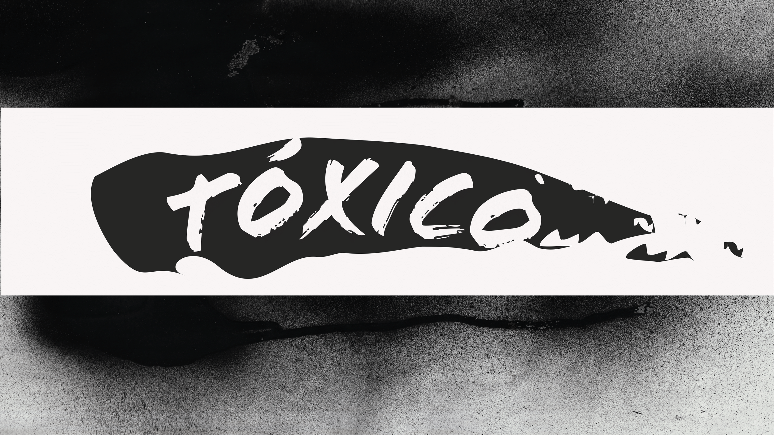
Tóxico's illustrations (below) and overall compositions of the deliverables was made inspired by artists like James Victore and David Carson. From a mix of rule-breaking grungy typography to a hand painted feel to the design I achieved my desired result to represent the brands identity.
Typography:
The typefaces I chose in my designs reflect the overall brand. I wanted to use a variety of script and display typefaces to emphasize the hand-made feel to the product. They also compliment the overall design and aesthetic of the brand being “deadly” and unique, similarly to augardente.
Colour Palette:
For the colour palette, I chose colours which are reminiscent of the beautiful atmosphere of Portugal as well as the fruits used for the different flavours (Passionfruit, Fig).
PAckaging & Multi-Media ad finals:
The final packaging and multi-media advertisement deliverables consist of: bottle labels, bottle box, a print ad, Instagram post, and business card.
Firstly, I researched how to communicate with young audience and how similar services and products that primarily address the same audience advertise for inspiration. I used strong typography and colours to create dynastic attractive compositions. I remained consistent with the colour palette and typography and used strong contrast between illustrations and type to create a bold design aesthetic.


Final Mockups:
The overall aesthetic is carried out through all compositions remaining grungy, hand-made, and bold. All compositions were made into mockups using tools in Photoshop. I used mockups that had a variety of 3D materials to make the surrounding materials look realistic and relative to the brand identity.


