

Unlucky Star- Branding & Multi-Media Ad design
Assets: Logo, Muti-Media Ad Designs.
Unlucky Star is a luxury unisex jewelry brand that is expanding into small batch apparel. I drew inspiration from brands such as Chrome Hearts and Heron Preston.
They specialize in hand made soldered rings inspired by all things edgy but they're best known for their star rings and ninja star designs as well.

Unlucky Star’s Rationale:
Unlucky Star sets an importance of individuality and showcasing your own individual style by creating unique small batch releases so each piece is handcrafted for you. Unlucky Star's mission piggybacks on this idea to encourage whoever buys their products to be uniquely yourself and to join a community of like minded people who like all things grungy, punk, and expressive. The goal was to create a brand for creatives who appreciate fine art and one of a kind products.
Key Words: Edgy, Punk, Quality, Unique
Target Audience:
• Age 20-35
• All sexes
• Greater Vancouver
• Fashion students/artists/working professionals
• Passionate about small batch, unique fashion
• Social Media Influencers & Artists
Moodboard & Logo Conceptual Stage:
For the logo design and overall aesthetic I was inspired by grunge and punk aesthetic in the graphic design, and fashion world. Similar to brands like Crome Hearts and Heron Preston. I wanted Unlucky Star to be edgy and commanding, so I incorporated those themes into the general aesthetic and logo design.
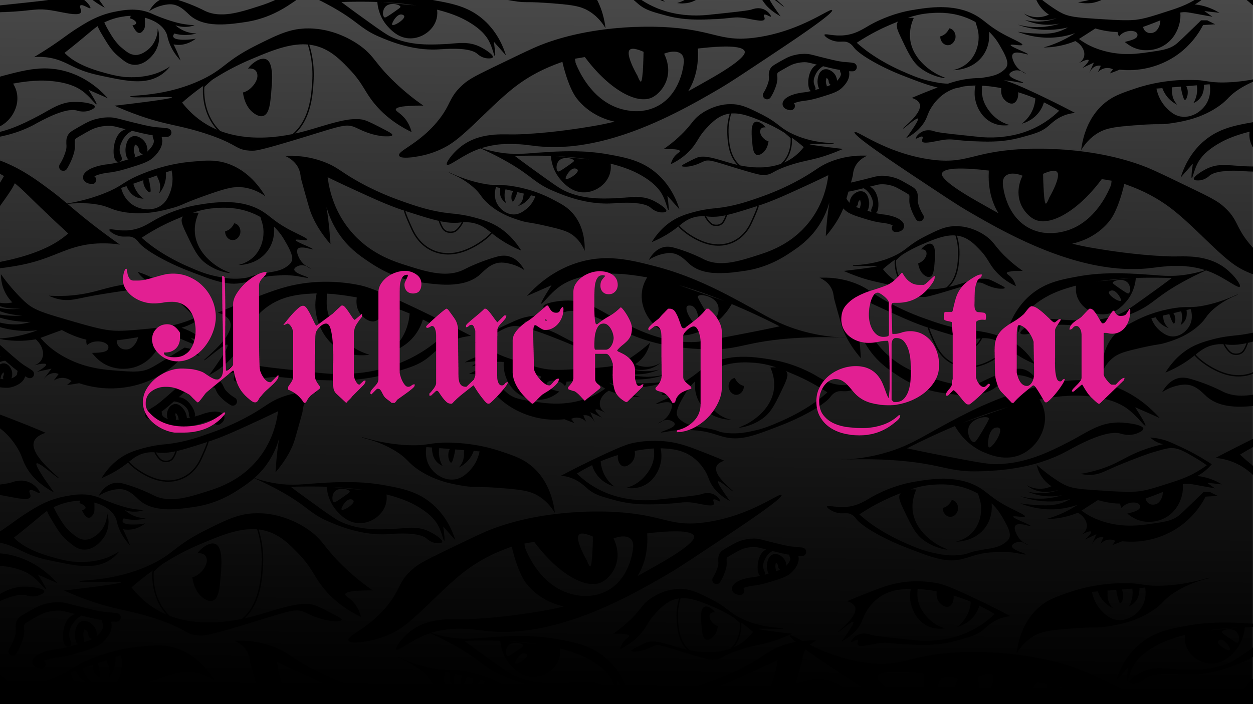
Unlucky Star's final logo (below) is a logotype of Plain Germanica and No More Justice Regular and an emblem made from an original illustration. It is gothic, edgy, and eye-catching to represent the brands identity.
Typography:
For the Logo, Plain Germanica and No More Justice Regular typefaces were used. Plain Geramanica is a gothic medieval font with sharp proportions and curves, making it a perfect font for Unlucky Star’s logo. The sharp edges and curves are reminiscent of the jewelry they solder.
American Typewriter Condensed will be used for all of Unlucky Star's body copy text. American Typewriter Condensed is an ode to the invention that shaped reading habits and the idea of legibility, the typewriter. A compromise between the rigidity of its ancestor and the expectations of the digital age, American Typewriter retains the typical typewriter alphabet forms, lending the font a hint of nostalgia.
Colour Palette:
This colour palette was chosen to be bold and eye-catching to represent the brand identity. All of the brand's apparel, merchandise and content is meant to be grungy and edgy.
Multi-Media ad finals:
The final multi-media advertisement deliverables consist of: a flyer, billboard, poster, handout, promotional banner, and a social media (LinkedIn, Facebook, YouTube) banner.
A requirement of this project was too keep all the same information across all ads and to compose each to have the best quality of legibility. I used strong typography and incorporated Unlucky Star's main headline and message throughout all ads. I remained consistent with the colour palette and typography and used original illustrations of eyes for the play on works with the headline. There is a strong contrast in hierarchy between images and type to create a bold design aesthetic and cohesive design.


Final Mockups:
I designed additional merchandise and apparel for a better feel of Unlucky Stars aesthetic. The overall aesthetic is carried out through all compositions remaining dynamic, edgy and grungy. All compositions were made into mockups using tools in Photoshop. I used mockups that had a variety of 3D materials to make the surrounding materials look realistic and relative to the brand identity.


